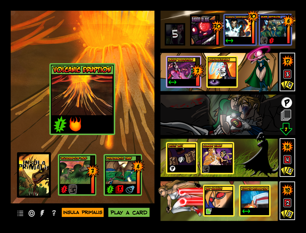
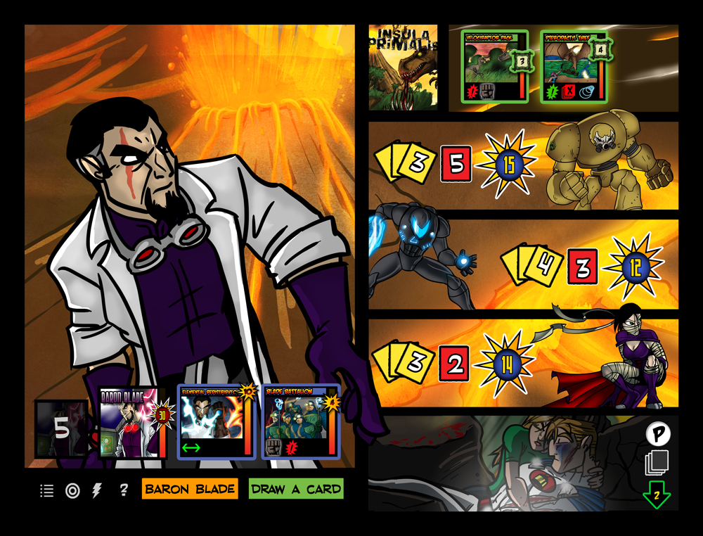
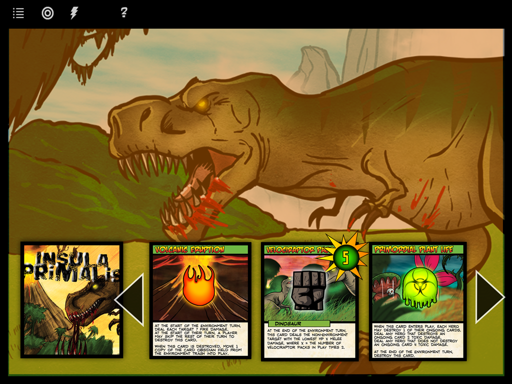
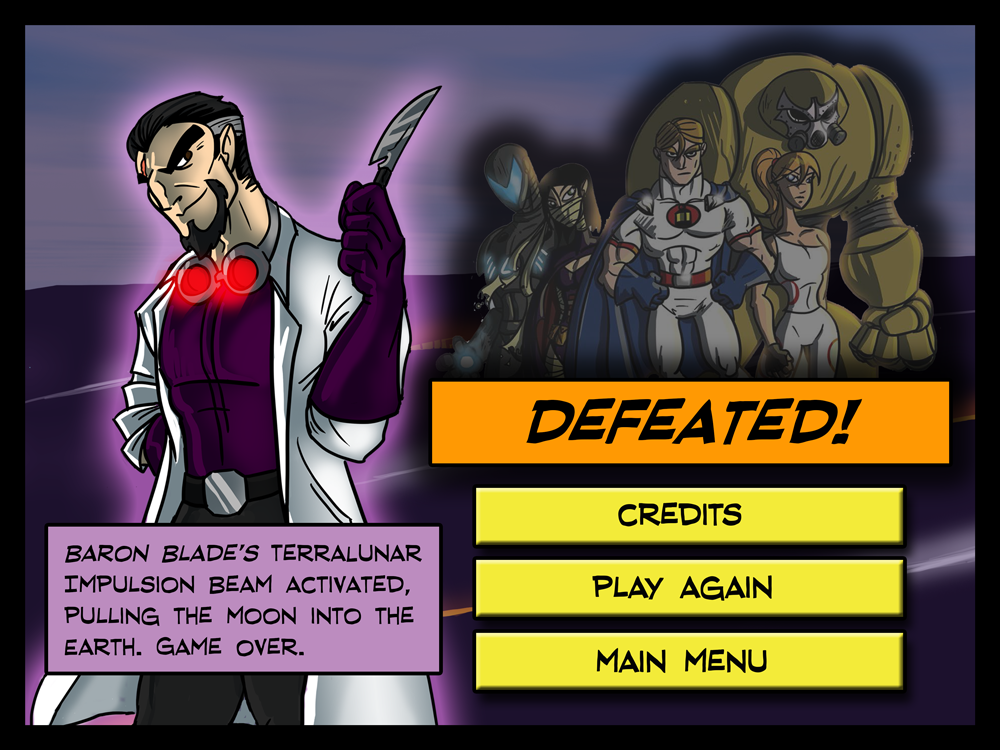
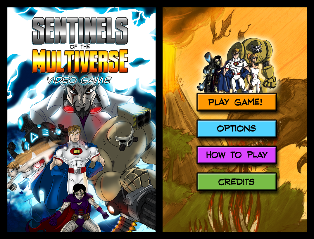
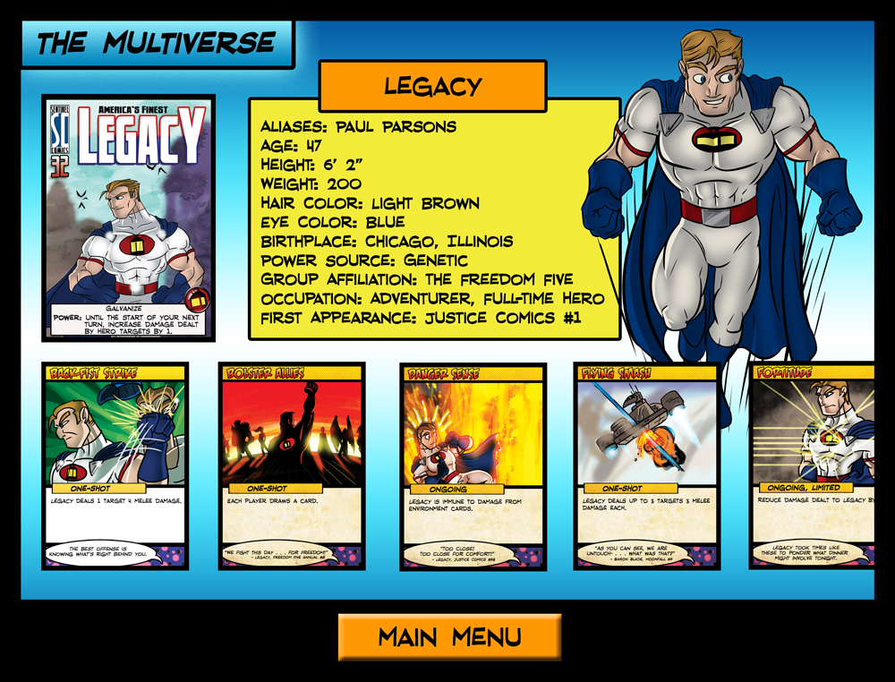
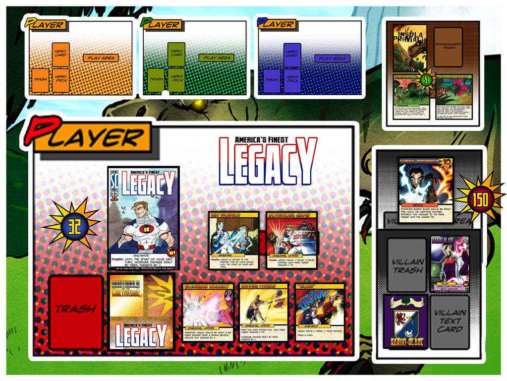
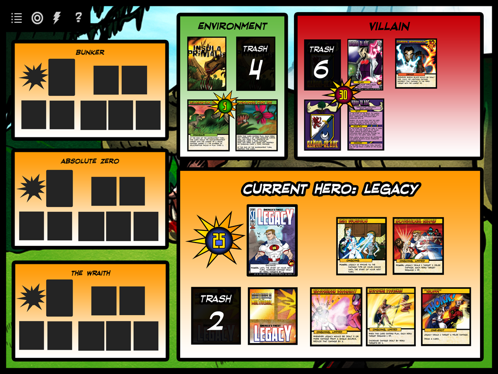
It will be one year ago tomorrow that we first released Sentinels of the Multiverse: The Video Game as a finished product. But it was more than a year before THAT that we began work on it. In honor of tomorrow, we’re taking a look back at the earliest days of The Sentinels’ journey into the digital world.
It all starts with a Sidekick
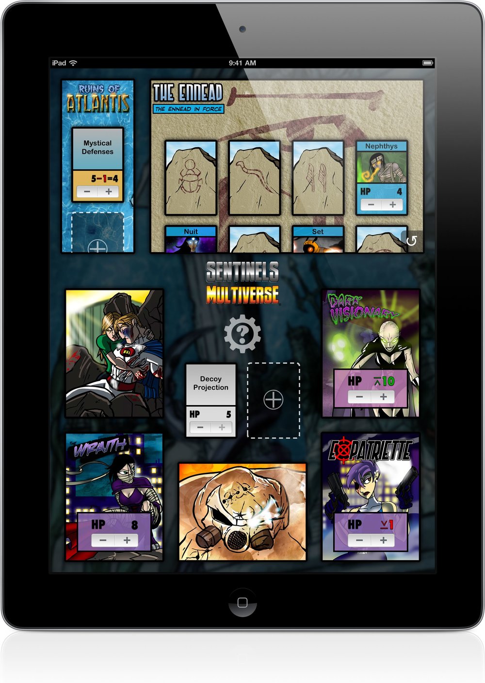
We first met Greater Than Games and learned about Sentinels of the Multiverse at PAX Prime 2011. John started playing the game and saw immediately that a player aid app would be useful. We released Sentinels Sidekick on the App Store in May 2012. It started as a very simple hit point tracking app for just 99 cents.
We continued to improve Sentinels Sidekick for about a year before we approached Greater Than Games about using the game artwork right in the app. That was when the app got a really nice facelift, as well as more new features like effect tracking.
Sentinels Sidekick 1.0
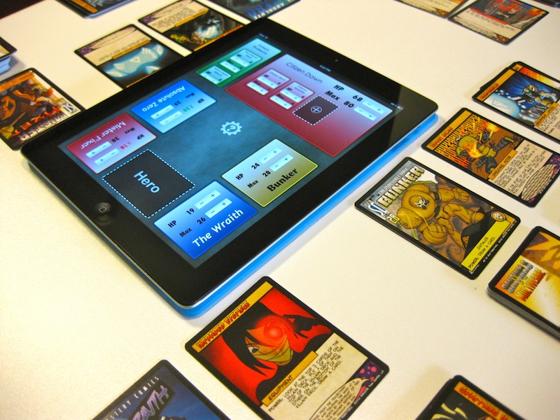
As it still does today, the App Store page included a usage photo taken on John's table.
Sentinels Sidekick 1.0
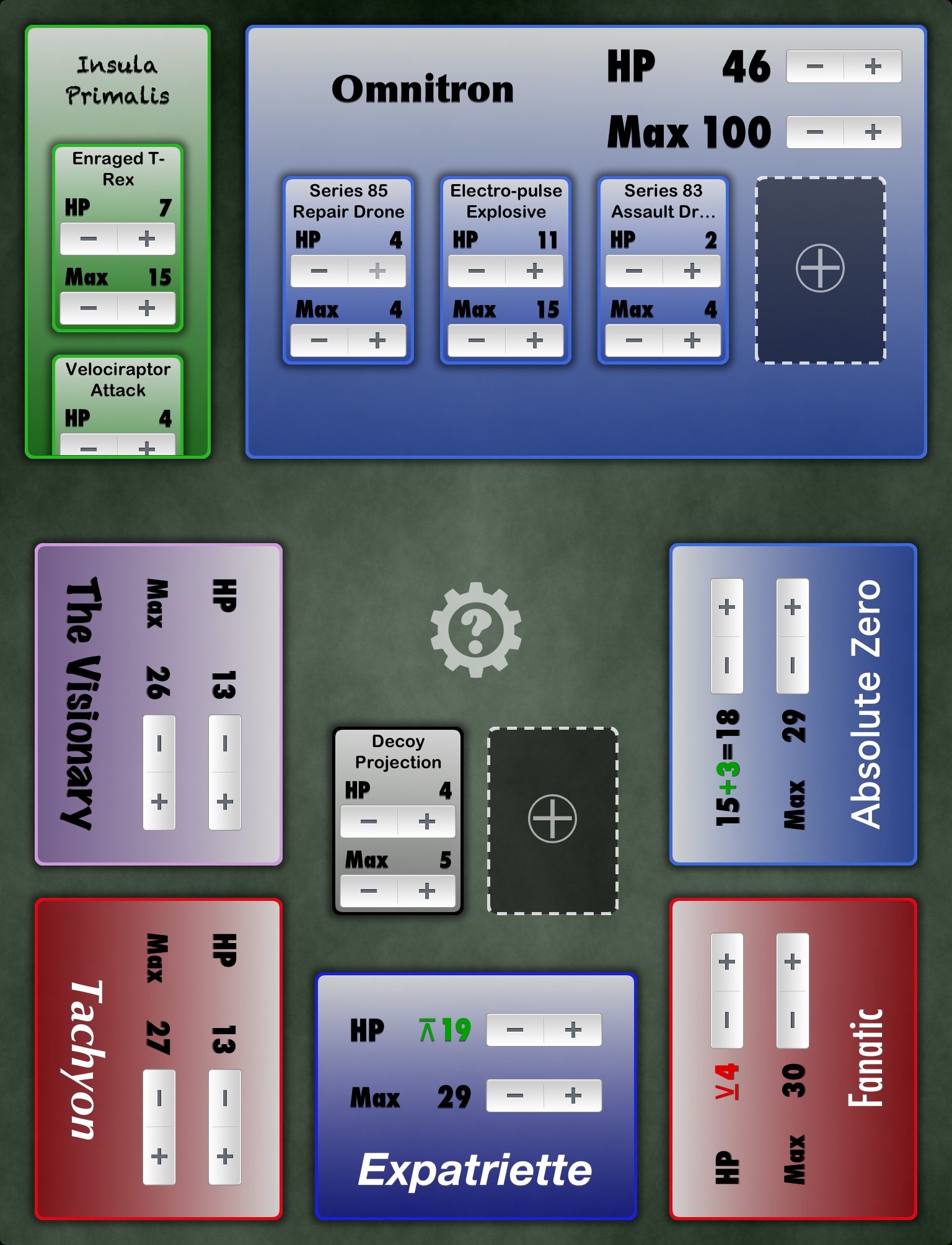
The original edition of Sentinels of the Multiverse included a mechanic where the maximum HP of cards could change. Sentinels Sidekick supported changing that as well as HP.
Sentinels Sidekick 1.0
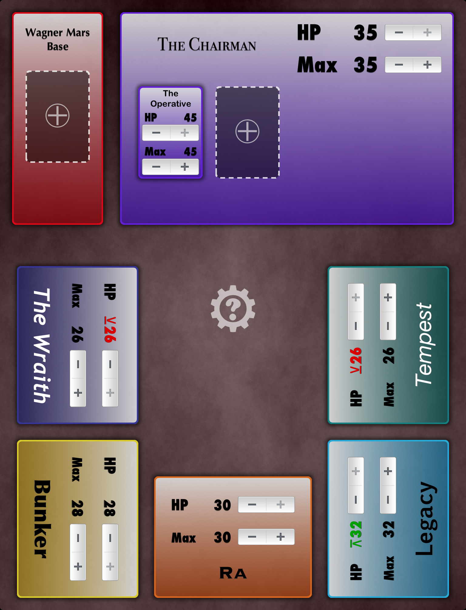
Without artwork we had to be creative with how we differentiated decks. Each deck has a unique color and font choice, and the environments tint the background.
Sentinels Sidekick 1.0
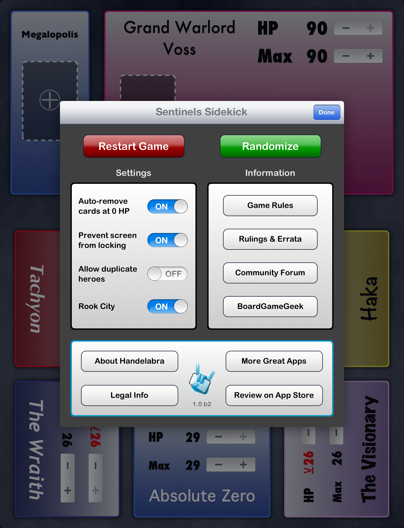
Our glorious first Tools popup with contemporary iOS 5 styling.
Sentinels Sidekick 2.0
The arrival of the official artwork! Target artwork would show up in a later update.
A contract and a dream
After working directly with us for Sentinels Sidekick, the folks at Greater Than Games decided we might actually be the right kind of people that they could trust to take the full game into the digital realm.
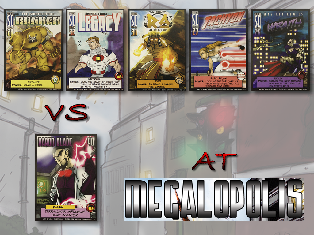
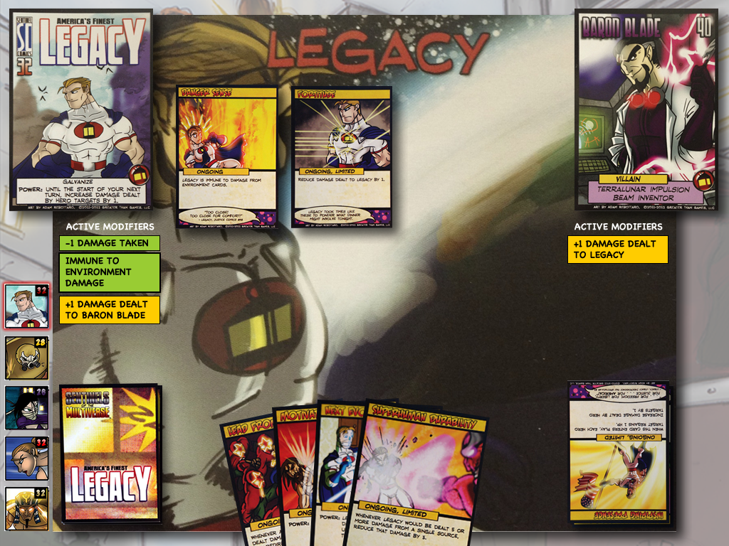
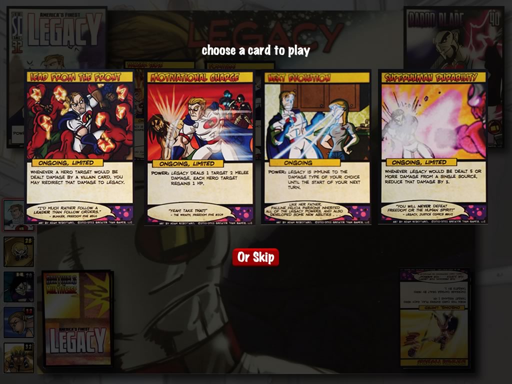
In the summer of 2013, we came to an agreement and we began creating a prototype that could be used as a proof of concept. Try not to laugh at how different this is from the final version that shipped a year ago!
Accelerated and Funded
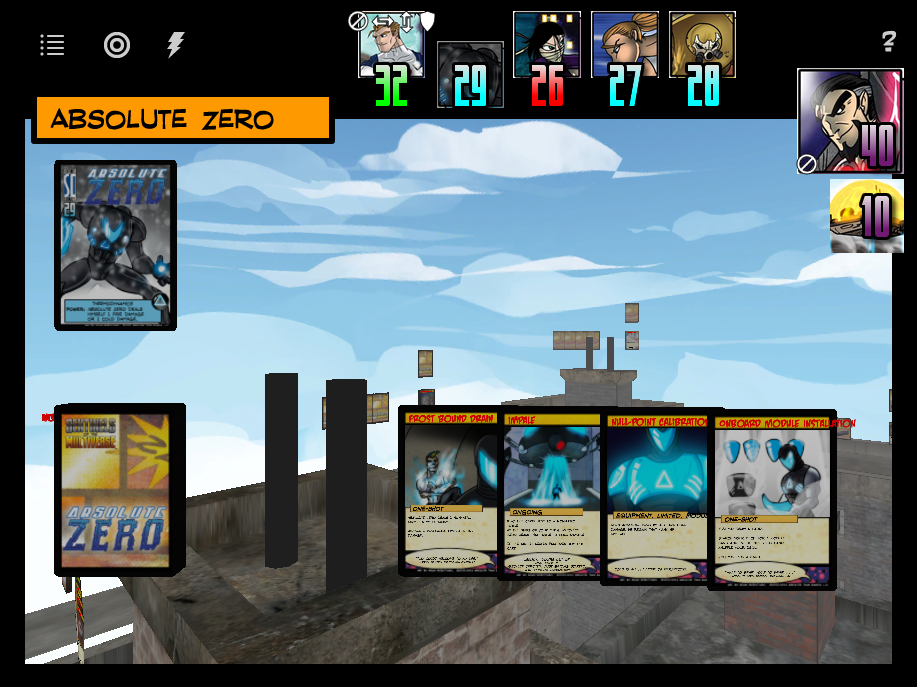
In late 2013, we went through the LaunchHouse startup accelerator in Cleveland which helped us hammer out whether we could really make a go of being a “digital tabletop” studio (short answer, we can). That led us to raise the funding to create the full game. In 2014, we fully dug into the prototyping and iteration that eventually lead to the 1.0 release (for iPad and Android tablets) on October 16th, 2014. Take a walk down memory lane with us below. Some of what you’ll find has never been seen outside the hallowed halls of Handelabra Games!
Original Prototype:
Game Start
An early prototype concept of the "new game" screen showing the match you are about to play.
Playfield Concept
An early idea of what the play field might have looked like in a more "literal" interpretation.
Play Card
Our very first play a card UI!
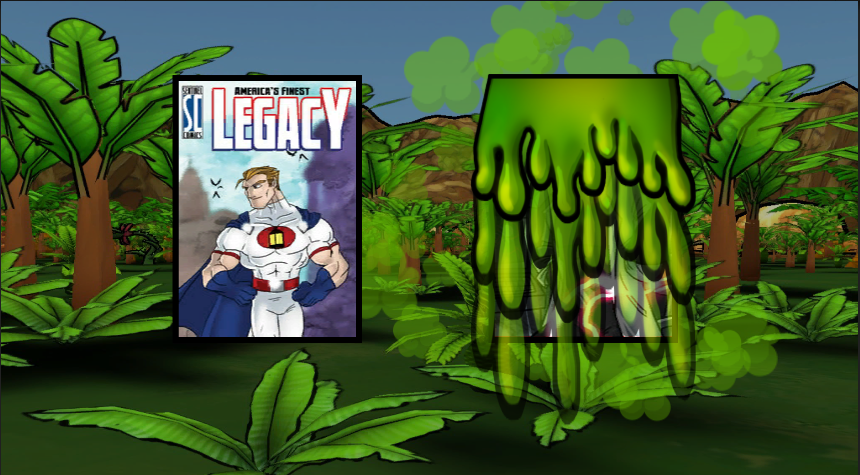
Player View
An early prototype showing the player view and overview.
Early Storyboards:
Game Start
The first storyboard of the game start screen. It looks pretty familiar!
Environment Turn
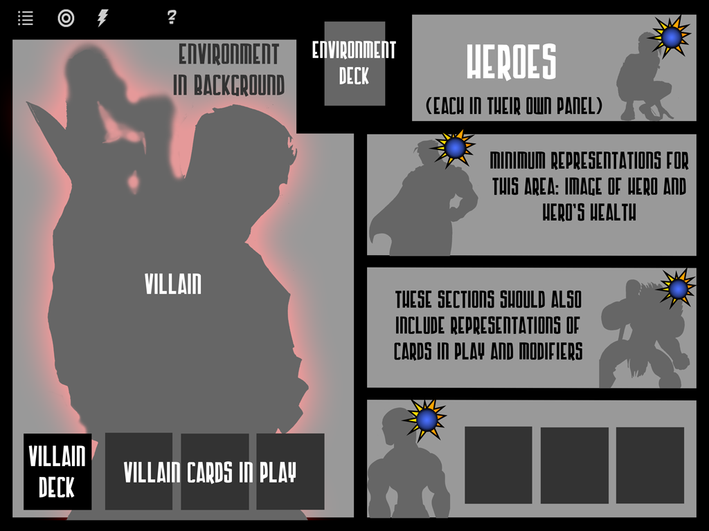
At first, we imagined the environment taking up the entire play field on its turn. We landed on it only taking up one page.
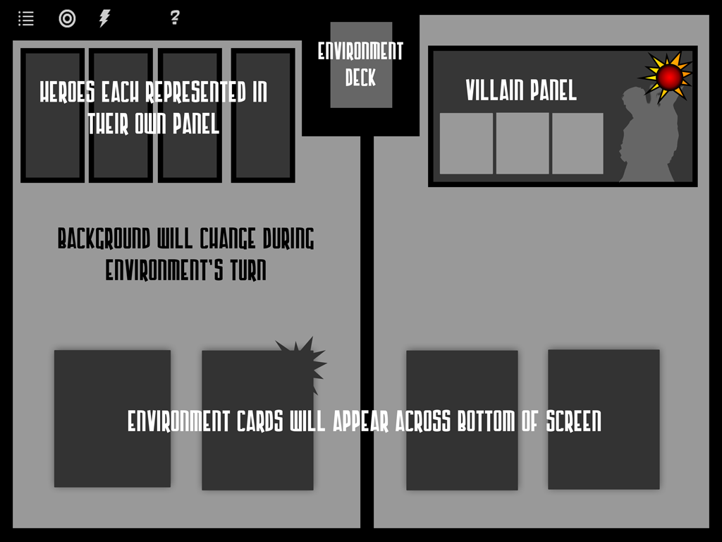
Environment Turn
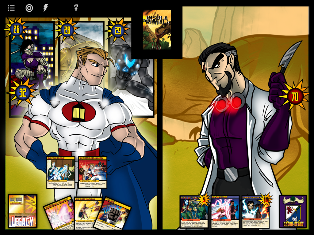
This is closer to what we ended up shipping.
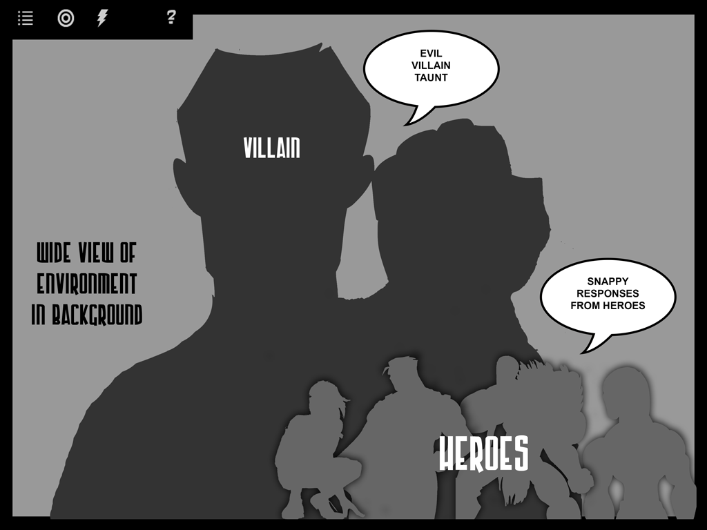
Villain Turn
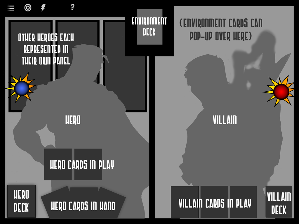
You can see that we stuck pretty close to this concept for villain turns. The layout regarding where everything else ended up changed a bit.
Hero Turn
This early storyboard had the active hero eclipsing the team behind them. This proved a bit too technically difficult to do well.
Concept Work
Game Start
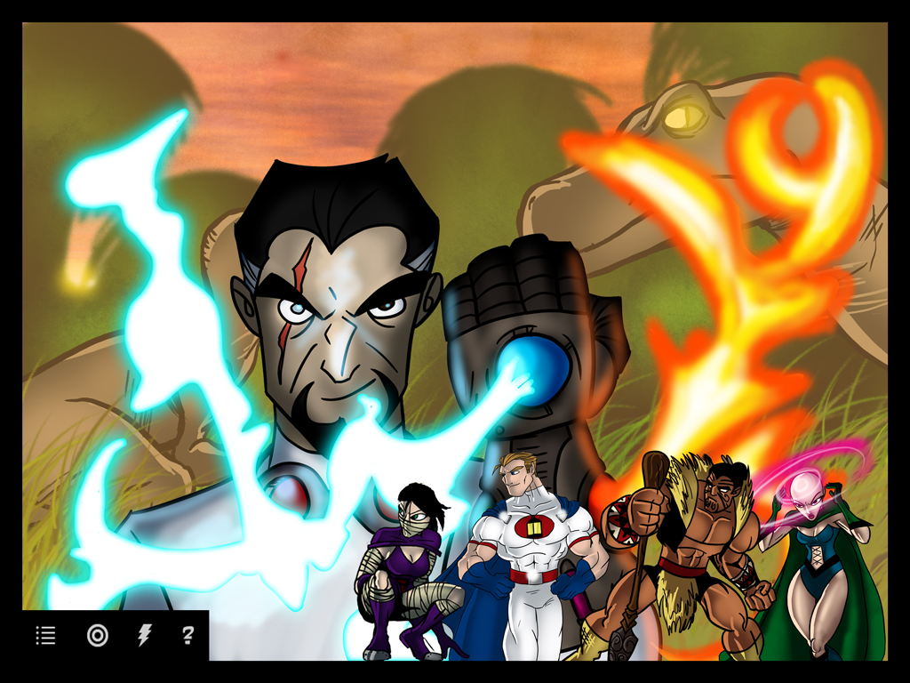
The first real graphical representation of the game start screen. It didn't ship in 1.0, but we got to it eventually.
Hero Turn
This concept looks really cool but we couldn't find a way to do it that also worked really well for gameplay.
Hero Turn
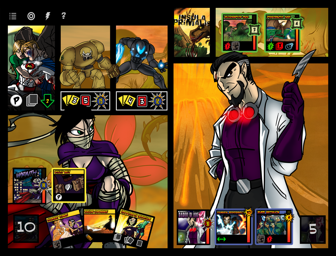
This is starting to look a bit more like what we shipped. You can see the "panels" idea really coming together.
Hero Detail View
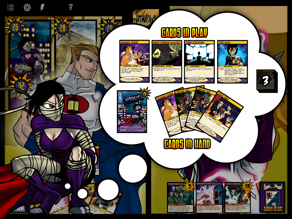
The thought bubble concept came to us early as a way to present info to players on demand and efficiently.
Target Selection
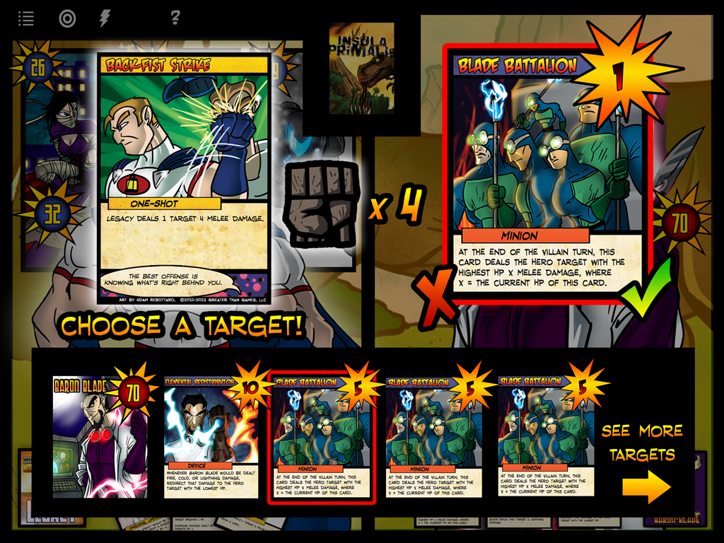
Here you can see not only target selection but the beginning of the "small card views" that would eventually become the primary way to manipulate cards in the game.
Discard Concept
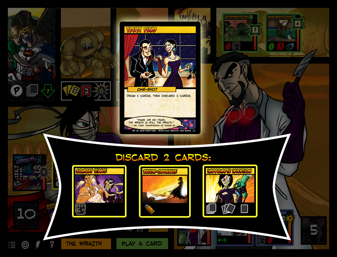
At first we considered different views for actions like target selection vs discarding. With discard, we ended up just allowing you to drag cards to a trash.
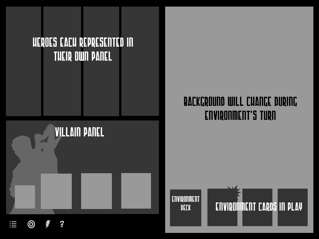
Environment Turn
We spent a lot of time iterating on the environment turn since it acts like a player, but isn't. Here it's on the opposite side, but you can also see the small cards evolving into something closer to what you see today.
Villain Turn
The main menu spent some time at the bottom of the screen while we were iterating. You can also see some early ideas for the hero panels.
Environment Turn
A really off-the-wall environment concept where nothing else is happening on screen.
End Game Concept
After some deep thought, we decided you probably didn't need to see the credits after every game.
Small Cards
Evolution of small cards, including iconography.
Small Cards
More iteration on iconography and hit point counters.
UI and Menus
New Game
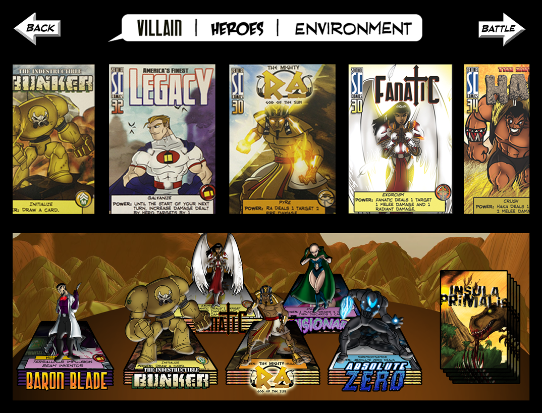
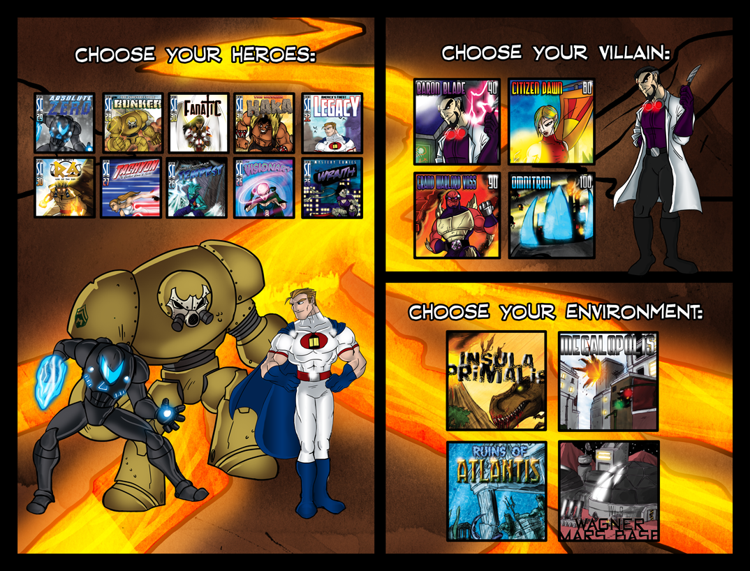
One of our first concepts for selecting which decks to play. We ended up staying pretty close to this idea in the final version.
New Game
A completely different idea for how to choose decks. Our issue with this was expanding it for expansion content.
Main Menu Concept
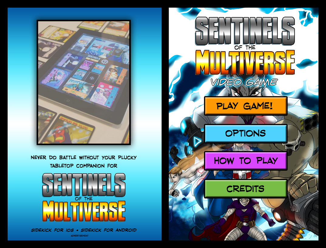
This concept is fairly close to what we ended up with in the initial version of the app, including the dynamically updated "news" section.
Main Menu Concept
Many of our ideas for the main menu included a lot of box art and comic book cover elements.
Multiverse Concept
This concept includes all of the elements that the Multiverse screen still has, but in a different arrangement.
Overview Concept
At first, we considered having a very focused "play view" and a separate "overview" based on an actual tabletop. We decided to mix the two into what we ended up shipping.
Overview Concept
We decided to leave out the overview and see if players wanted it. We received exactly zero requests for such a thing, so it seems we made the right decision!
Small Card Concepts
Here you can see many different ideas we played with for "small cards." No bad ideas in brainstorming.
Other
We like to have fun!
Game Start
One idea we had was to make the first hero a "team leader" and have the game opening screen only show a face-off between the villain and one hero.
Game Start
Another face-off concept. Mortal Kombat anyone?
Toxic Damage Concept
Some early work on the damage animations.
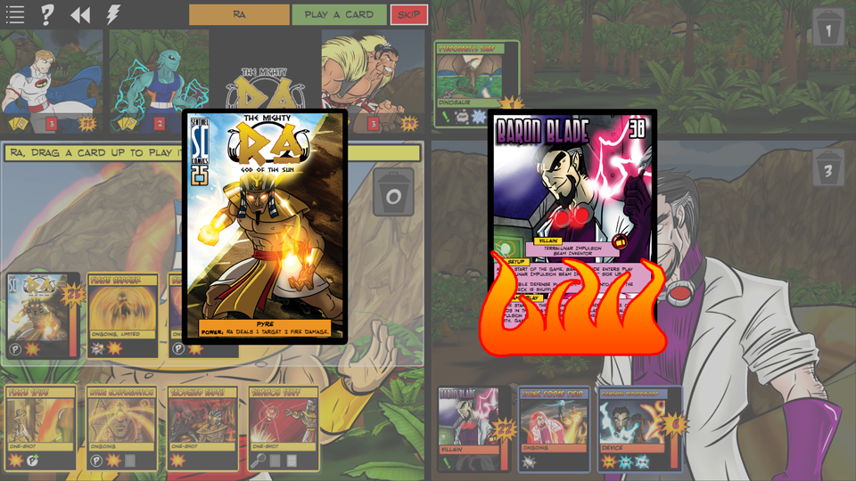
Fire Damage Concept
Or as Jeremy calls it, "hot damage."
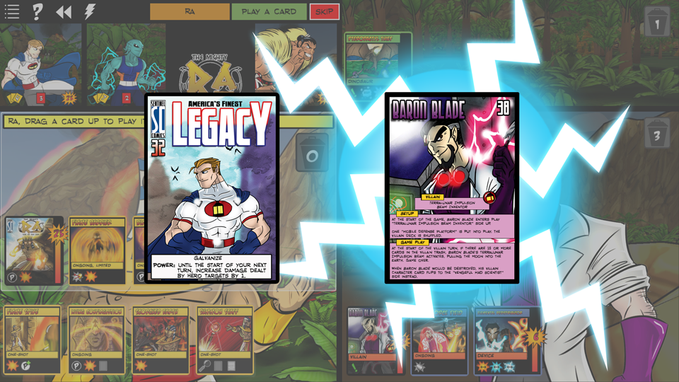
Lightning Damage Concept
Working on some z-order issues..
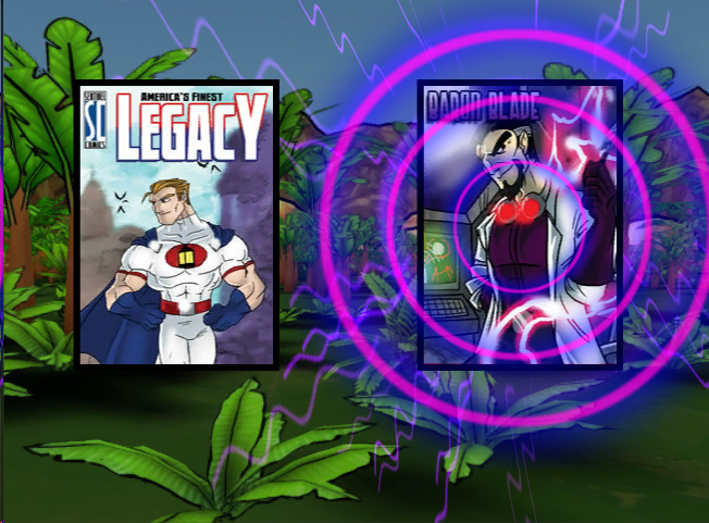
Psychic Damage Concept
This one ended up being pretty close to the final version.
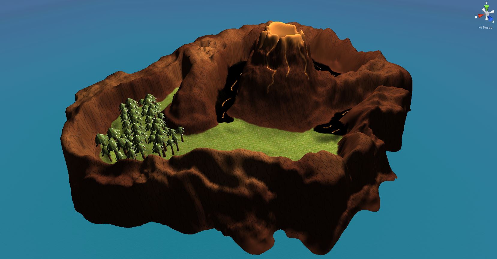
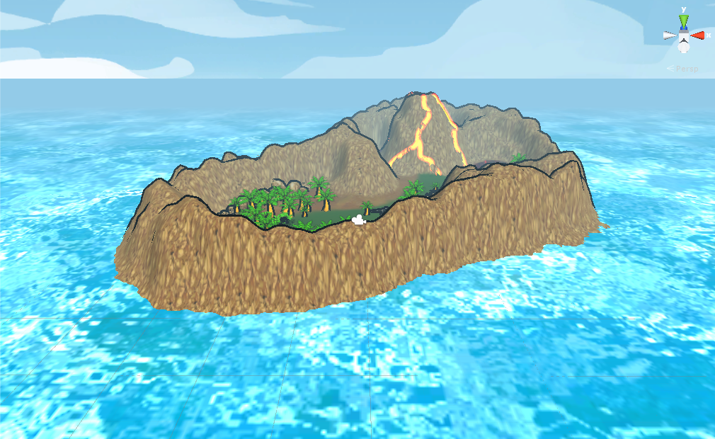
Insula Primalis
Early 3D work on the island. This was the first environment we built and it was quite a learning experience.
Insula Primalis
A wide shot of the entire island.